How to Create an Effective Webinar Landing Page + Templates

When it comes to creating a well-optimized webinar landing page, selecting the right tool or template can make all the difference. The good news is that there are numerous platforms and templates available out there to help you create engaging and high-converting webinar landing pages. Whether you use the same tool that your website is built on or something new, I’m here to show you some viable options.
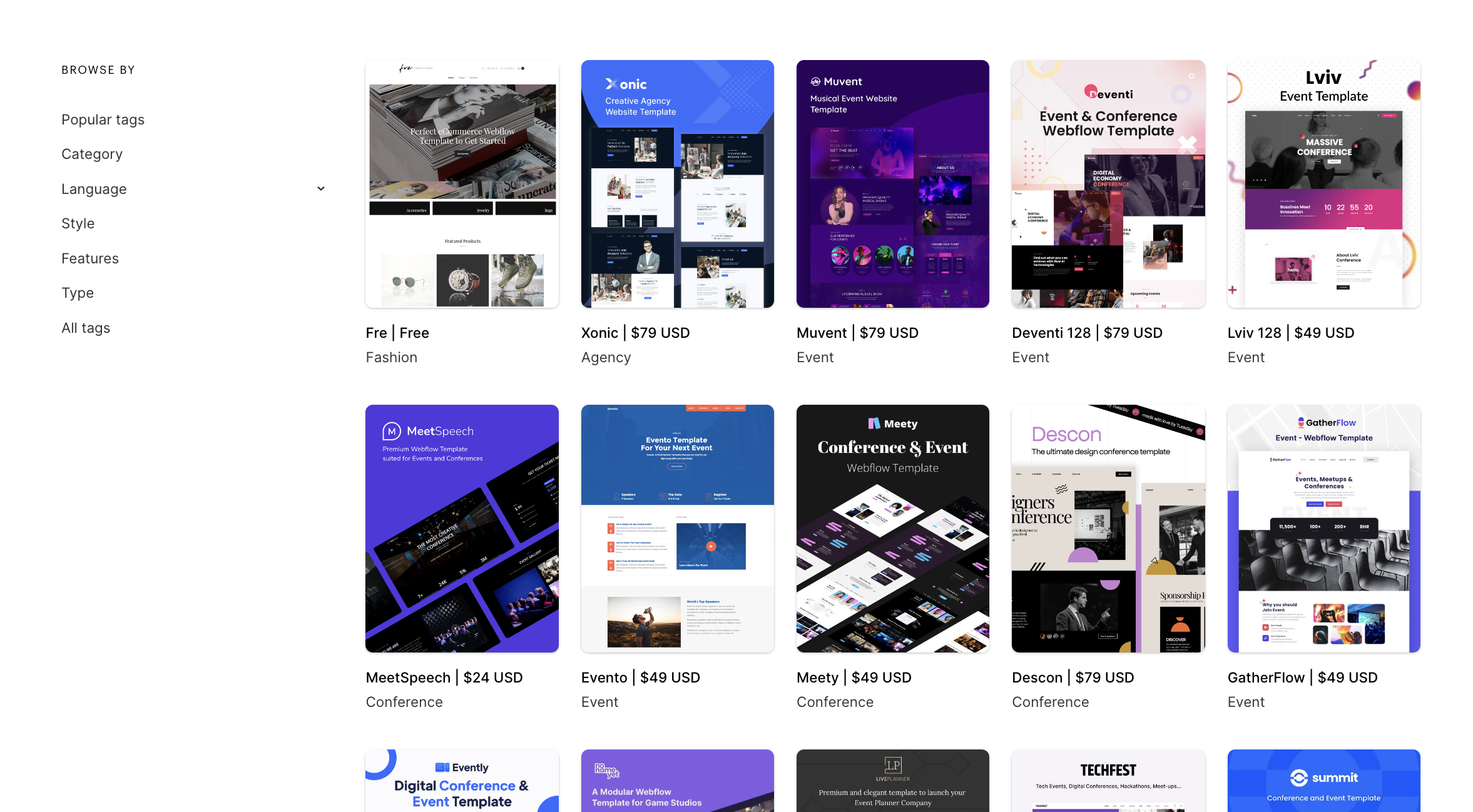
Webflow Webinar Landing Page Templates
Webflow provides a powerful platform for designing professional-looking webinar landing pages without needing any coding skills. It allows seamless integration of webinar sign-up forms and CTAs while offering amazing responsive design capabilities for your landing page.
The defining attribute of this tool is its potent visual builder. By emphasizing an intuitive design interface instead of lines of code, it enables anyone to build visually stunning webinar registration pages—a key component in increasing your signup rates.
This is what we use to build the Game Changers webinar landing pages at Sequel.io and have found it to be a super intuitive web builder. Check out all their webinar event templates, here.
WordPress
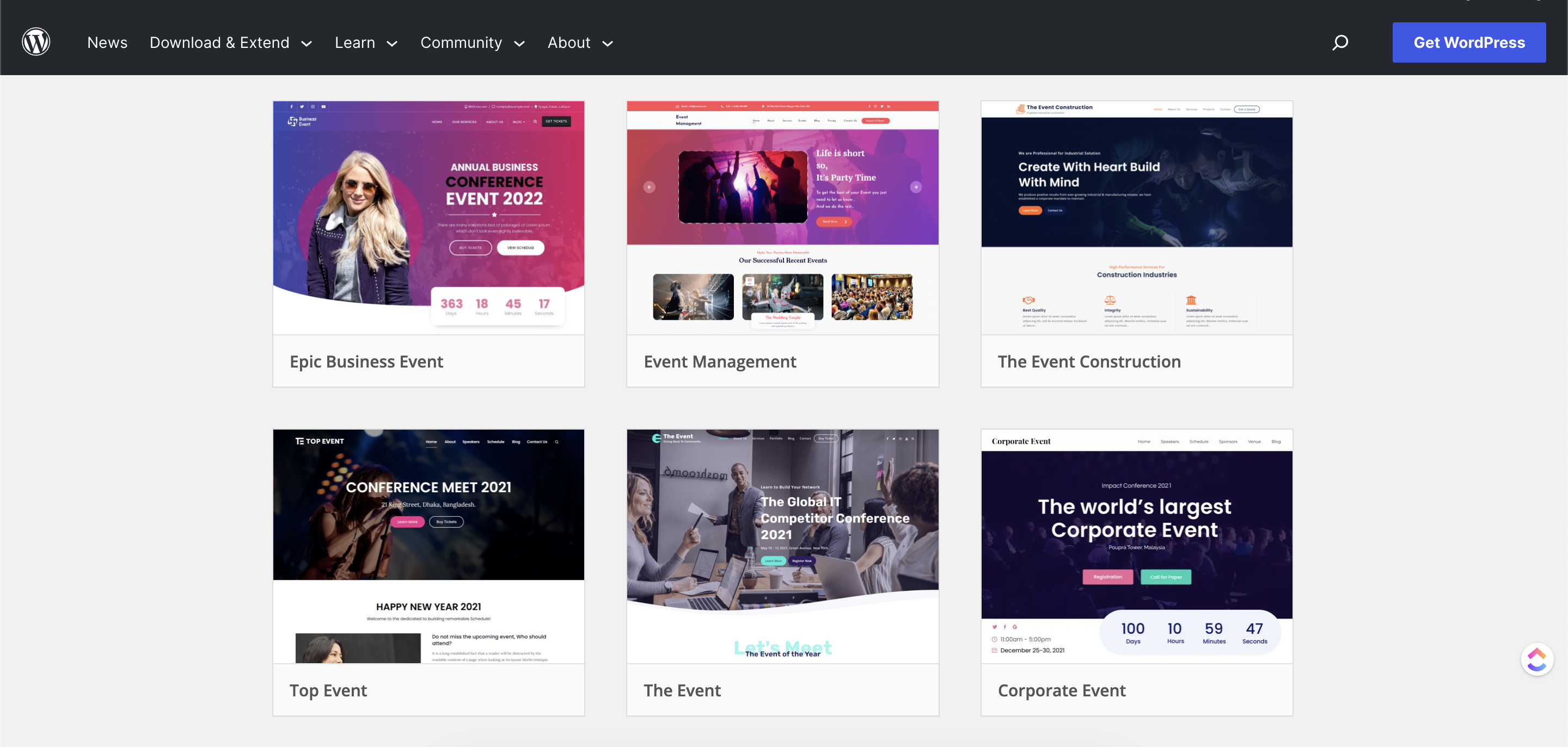
Renowned for its versatility, WordPress is another effective tool for crafting your desired webinar landing page template. Leveraging plugins like Elementor or WPBakery could significantly streamline the creation process, allowing even beginners to conjure high-quality designs effortlessly.
Moreover, WordPress’s vast array of pre-designed website templates could serve as excellent starting points for constructing your own unique webinar landing page. If you are already familiar with this website builder, great! But if you aren’t well-versed in creating landing pages in WordPress, you may want to stick to something a little more intuitive or out-of-the-box. Search their landing page themes, here, to start building.
Unbounce
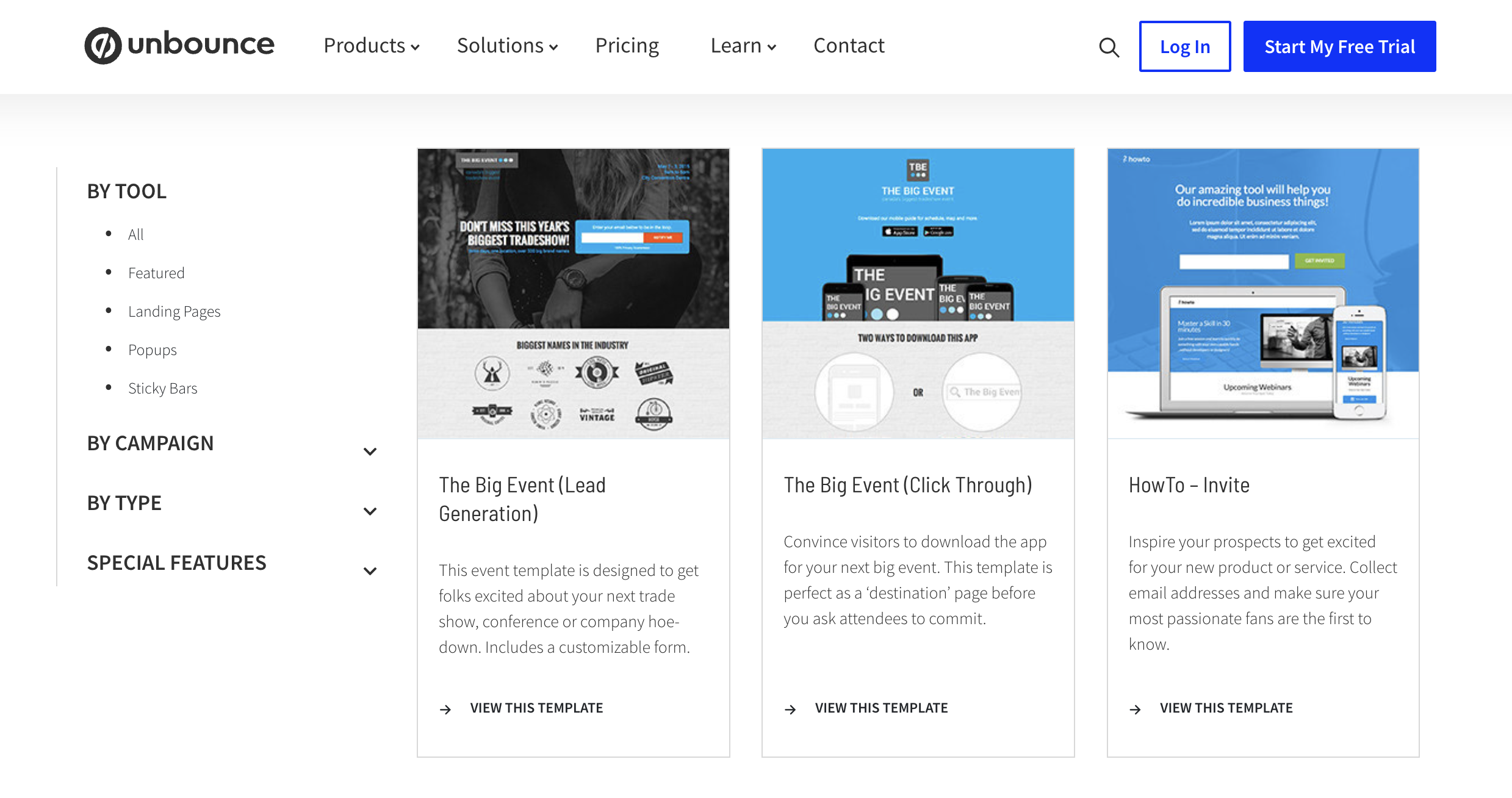
Unbounce specializes in building robust and high-converting landing pages including those tailored specifically towards webinars. With their impressive suite of tools such as drag-and-drop builders score A/B testing facilities, deploying world-class webinar pages was never easier.
Their intuitive layouts combined with user-friendly functionality make them suitable for businesses regardless of their technical know-how level. Beyond these features lies a vast library filled with proven-to-perform webinar landing page examples at your disposal.
Instapage
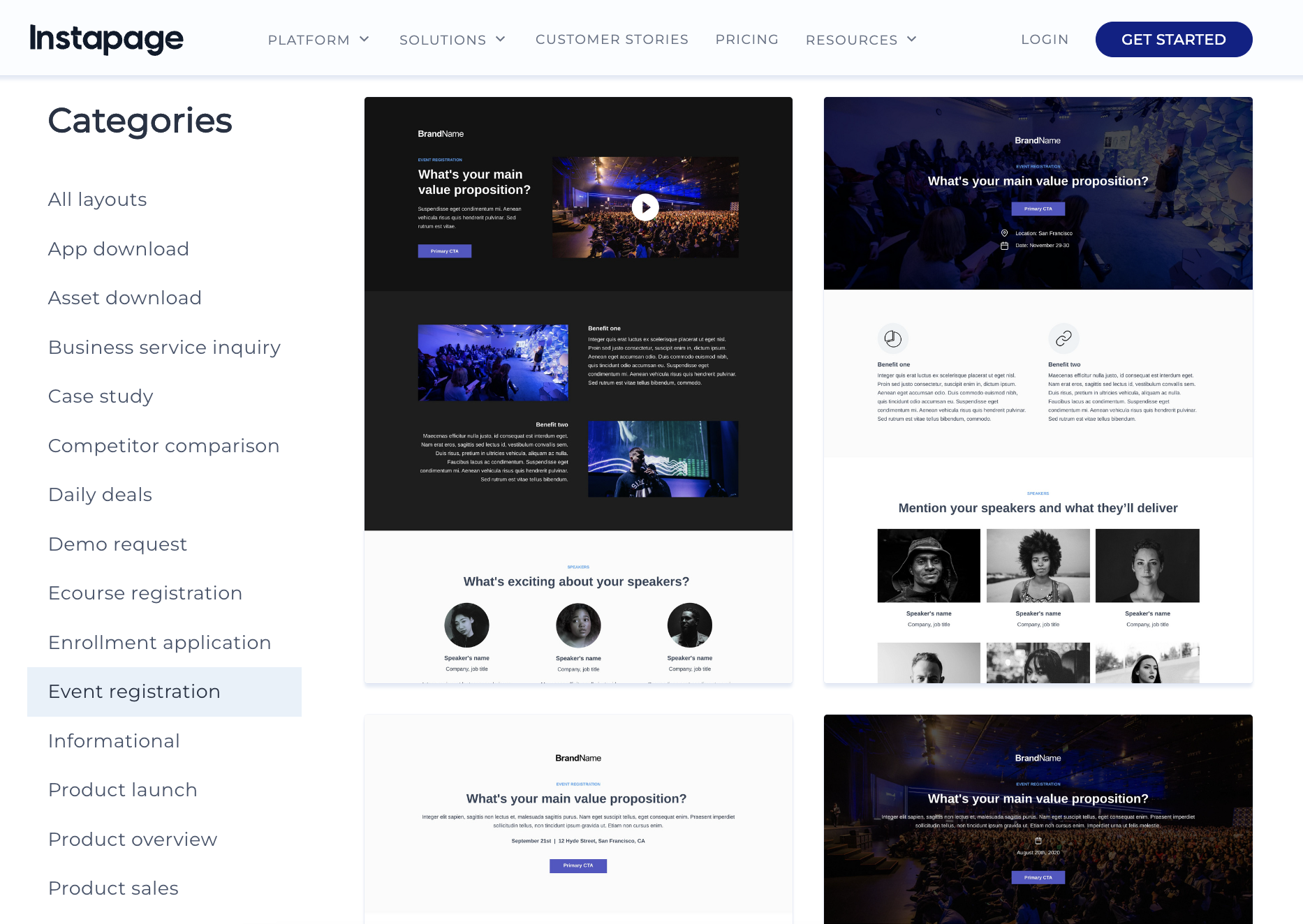
Instapage offers refined tools focused on post-click optimizations—making it particularly beneficial when devising strategies around paid ad campaigns leading visitors straight onto your prized webinar sign-up page
Using Instapage’s sophisticated analytics systems alongside heatmap insights is bound to let you observe user behavior like no other provider—blessing marketers with golden opportunities like refining registration form positioning or tweaking button color schemes based on real data patterns adding that extra edge essential in today’s competitive digital space.
Creating an effective and enticing online environment where potentials feel compelled enough to convert—from curious visitors to active participants—is non-negotiable if you desire fruitful results from your chosen promotional tool: webinars.
Tips for Generating Leads with Your Webinar Landing Page
One crucial aspect of a successful webinar landing page is its capacity to garner leads effectively. Here are some practical strategies on how to maximize the lead generation potential of your webinar landing page:
- Offer Value Upfront: In order to encourage visitors to sign up for your webinar, you must promise them something valuable in return for their time. This can be unique insights, actionable advice, or skills they wouldn’t find elsewhere.
- Leverage Scarcity and Urgency: Create a sense of urgency around signing up by including countdown timers, emphasizing the limited slots available, or mentioning an exclusive bonus only for early registrants.
- Integrate Lead Magnets: Integrating lead magnets into your webinar landing pages is another effective strategy for boosting sign-ups. These could be free ebooks, reports, tools, or checklists that would complement the content covered in the webinar.
- Use Compelling CTAs: The CTA button should drive action and convince prospects why they need to register at that moment. Phrases such as “Reserve Your Spot Now” or “Don’t Miss Out” might work well.
- Segment Your Audience Personalize your attendees’ experience right from registration using segmented email campaigns based on factors like job roles, industries, etc., which will deliver more targeted communication resulting in higher conversions.
Remember that every small detail matters when it comes to generating leads through a webinar landing page: design aesthetics, tone of copywriting, CTA positioning—all contribute towards making your webpage a prospect magnet!
Analyzing the Performance of Your Webinar Landing Page
Effectively analyzing the performance of your webinar landing page is essential for fine-tuning your overall strategy. As you gain insights into what works and what doesn’t, you can make adjustments to increase conversion rates and engagement with your audience.
To properly evaluate a page’s success, consider utilizing analytics tools like Google Analytics or any in-house software available on the platforms where you built your webinar landing page.
Key Performance Indicators (KPIs)
Set appropriate KPIs, or Key Performance Indicators, to gauge your success. Especially:
- Visitor Count: How many individuals visited your webinar landing page? This will provide you with an overview of how well you are drawing visitors.
- Signup Rate: What percentage of those visitors actually signed up for the webinar via the registration form? This offers insight into the effectiveness of your call to action and registration process.
- Bounce Rate & Time on Page: Are people leaving the webinar page without taking any action? A high bounce rate indicates there might be room for improvement in engaging users’ attention. The time on page metric also shows you if people are actually interested and engaging with the webinar when you go live.
- Conversion Rates: The ultimate measure — how many sign-ups converted into actual participants in your event? If you host your webinars on your website, you’ll easily be able to determine what your conversion rate is compared to using a 3rd party platform.
Do A Comparison Between Different Webinars
While single-webinar analysis provides useful data, it becomes even more powerful when contrasted against your previous webinars – highlighting trends and changes over time so that successful elements from past experiences can be identified and replicated.
Aspects such as completion rate variances between different presenters or topics should also be reviewed since they provide vital data about attendee preferences for future planning.
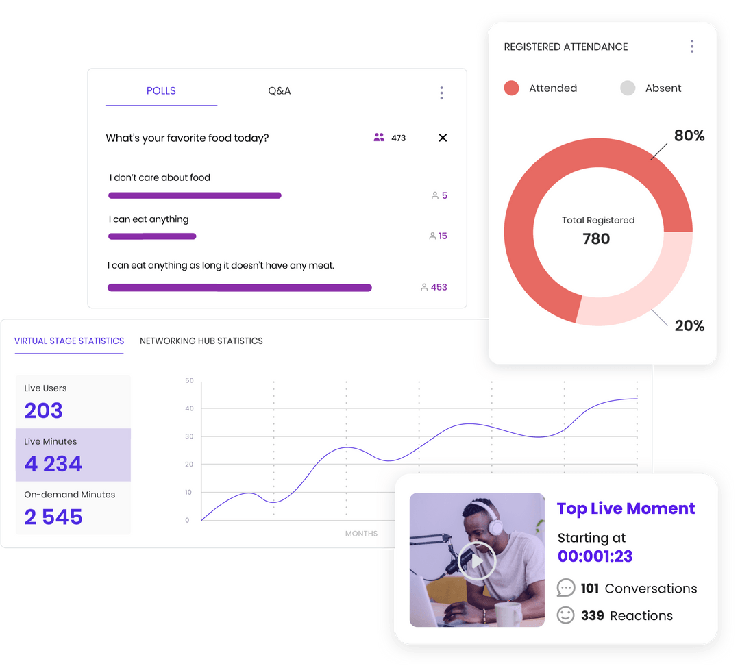
User Behavior Analysis
Observing user behavior too can prove invaluable. Examining how long users stay on specific sections of the landing page or which links caught their attention most informs future layout and design decisions – thereby continuously improving user experience while keeping them engaged longer.
Conclusion
Drawing to a close, we’ve plunged deep into the world of webinar landing pages. These platforms are key instruments in locking down your target audience and maximizing turnout for your virtual seminars. The art of designing an efficient webinar landing page lies in striking a perfect balance between eye-catching visuals, punchy headlines, enticing copywriting, and decisive CTAs.
Sprinkling throughout these five essential elements will significantly increase your attendee rates. Let’s not forget about making your landing page SEO-optimized, backed by solid reviews and mobile responsiveness. Deploying these tactics will position you at vantage points where potential leads can easily spot and flock toward your webinar sign-up buttons.
Overall, creating captivating and lead-generating webinar registration pages is no cakewalk but with the right tools and templates ranging from Webflow to Instapage, you’re already well on your way in the journey. Remember – feedback drives improvement! Regularly analyzing the performance of your webinar page will help identify weak points to fortify while spotlighting what works best for you.
If you’re curious about how companies are creating valuable and engaging webinar landing pages check out these examples including companies like Carta and Userpilot. These examples will surely round out your expertise & help you craft the perfect webinar landing page.
Ultimately, worthwhile webinars embedded on engaging landing pages remain a dynamic duo unmatched – one that guarantees thought leadership content for attendees alongside a fruitful lead generation pipeline for hosts like yourself – truly a win-win scenario.