7 Webinar Landing Page Examples & Templates You Can Steal
Webinar landing pages are stealthy tools, capturing leads with precision ease and establishing an arena for value-packed presentations to unfold. But what sets apart a regular webinar landing page from an exemplary one that fuels audience growth and enhances user engagement immaculately? Turns out, quite a bit.
In this in-depth guide, I’ll walk you through some amazing examples of webinar landing pages that have knocked it out of the park. Not only will you gather inspiration but also get armed with practical templates to build your compelling webinar landing pages. Here’s what we’ll cover:
- What’s a webinar landing page?
- Why you need a webinar landing page?
- Essential elements of a webinar landing page
- Examples of great webinar landing pages
What is a Webinar Landing Page?
A webinar landing page is your best ally when it comes to converting curious visitors into committed event attendees and even into customers. Just as the name suggests, it “lands” potential registrants on a specially designed webpage that captures their attention and entices them about your content & brand as a whole.
This nugget-sized piece of internet real estate carries significant importance: it’s where interested users learn more about your event, absorb key details such as topic, date/time, and presenter credentials and ultimately decide if they’ll hit that all-crucial ‘Sign Up’ button or not.
A high-quality webinar landing page goes beyond being just an information bulletin board; it serves as an influential pitch perfectly aligned with persuasion principles. Through compelling headlines, impactful visuals, concise content, and persuasive call-to-action (CTA) buttons—each element works in harmony aiming at conversions rather than mere views.
But one crucial thing to remember is that you only need one landing page for both registrations and hosting the live webinar. It creates a better audience experience and is less work for you. Why not keep people on your website if that’s where they’ll convert in the end?
In essence – A savvy marketer perceives the webinar landing page as less like ancillary real estate and more like a conversion-oriented machine helping transform simple interest into tangible sign-ups.
Why You Need a Webinar Landing Page
Establishing a strong online presence has become crucial, especially when it comes to webinars. An essential tool in achieving this objective is the webinar landing page. It works as your primary communication channel, directly bridging the gap between you and potential attendees.
As a facilitator, your task involves more than simply sharing information; you’re also required to convince interested individuals why they should sign up for your presentation. Just luring traffic to an ordinary webpage won’t cut it – hence, the call for a dedicated webinar landing page.
1. Capture Leads Effectively: The first reason stems from the ability of these pages to capture leads effectively. Once someone clicks on your webinar link, they are already showing interest – now’s your chance! By means of a registration form situated on your webinar landing page, you can obtain valuable data about these prospective attendees.
2. Enhance audience engagement: With a compelling headline and intriguing content that unfolds what participants would gain from the webinar, you can enhance engagement levels. Not only does this increase your sign-ups but improves conversion rates since many visitors will be engrossed in your brand experience – not to mention put in front of high-intent CTAs.
Personalizing user experience stands as another critical factor behind using a webinar landing page. Given its versatility, such platforms allow detailed descriptions of what the event entails while utilizing attention-grabbing & branded visuals or graphics that reinforce your message points.
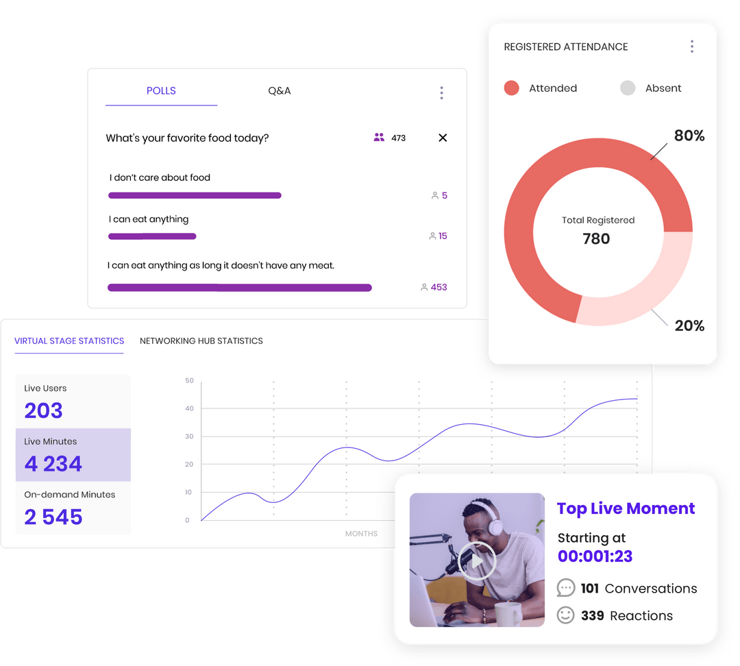
3. Boost SEO rankings: While putting together all necessary details like date, time, and presenter info into one centralized spot appeals convenience-wise to users; parallels drawn from best webinar landing pages indicate considerable boosts in SEO rankings which results in increased discoverability too. And if you’re hosting a webinar directly on your website, the video content will help your landing page serge in SEO results.
Therefore having an exceptional event-specific page paves the way for effective promotion before the actual commencement of any given webinar – ultimately contributing towards improved success rates!
Essential Elements of a Webinar Landing Page
A well-crafted webinar landing page is more than just an attractive design. There are fundamental parts to include that can help guide visitors toward signing up. Let’s delve into each of these essential elements.
Headline
The headline is arguably the most crucial part of your webinar landing page – it’s the first thing readers encounter. A strong, compelling headline singles out your target audience and crystalizes why they should not miss your webinar. Use persuasive language that resonates with their pain points or showcases unique benefits, making sure it complements the overarching theme of your online event.
Here’s where great copywriting skills shine, as you need to condense your webinar uniqueness into a single line—the trick is not doing so at the cost of clarity or relevance for your readers. Avoid complex words and convoluted phrases—a clean-cut, straightforward headline often has more weight.
Content & Copywriting
Following a captivating headline is content catered around fulfilling its promise. The details of what attendees will learn from participating in the webinar must be included here but compactly summarized, still conserving intrigue and interest in participation.
This section requires careful wording—engaging yet directive—compelling potential attendees to continue down the landing page while nurturing trust in the value promised by the event. Highlight irresistible takeaways from your event such as exclusive resources or expert insights.
Well-structured bullet points could work effectively here—they deliver compact information within digestibility standards without overwhelming prospects.
Call to Action (CTA)
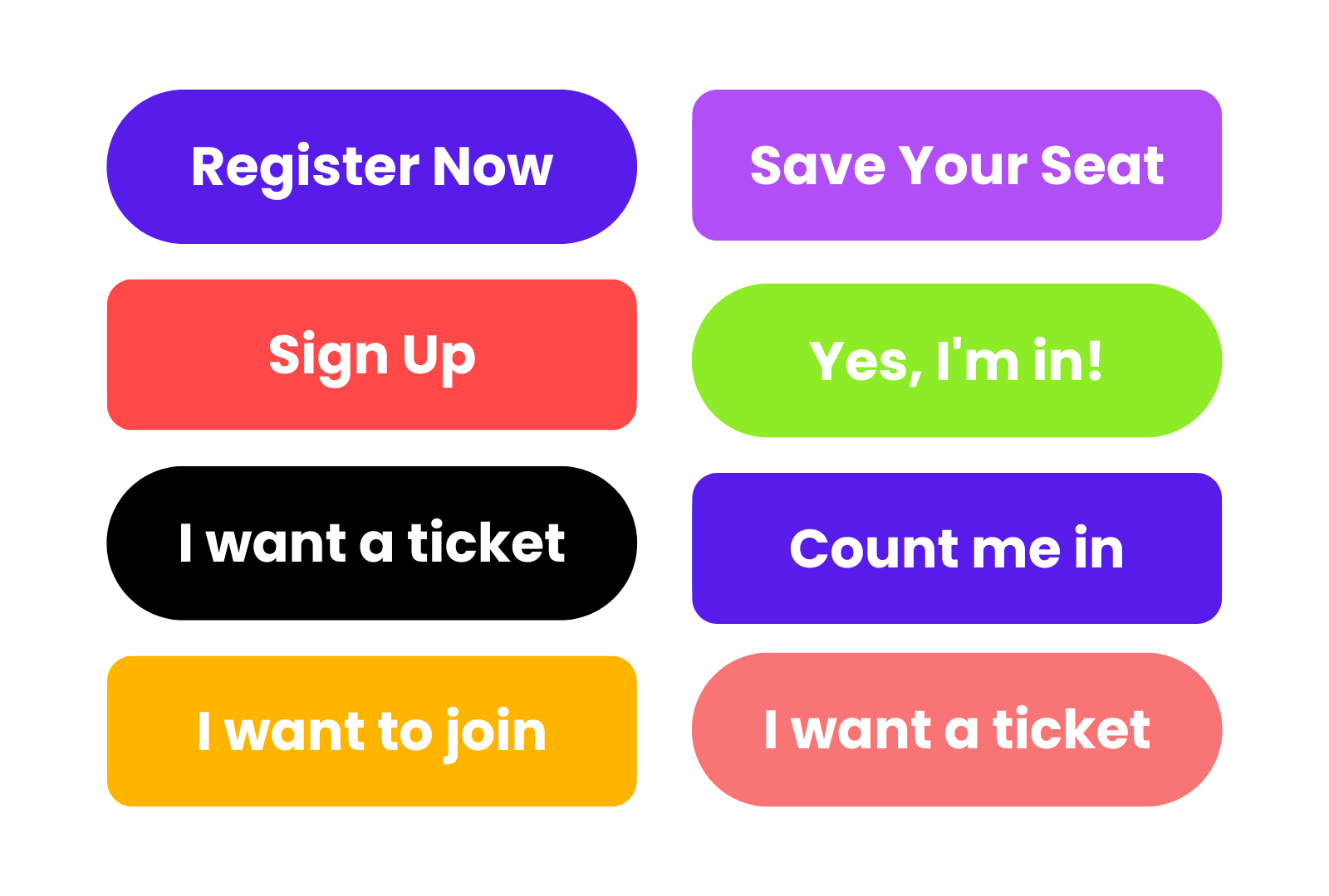
The Call to Action (CTA) is here to strengthen your lead generation strategy—it directs leads on tangible steps to secure spaces for upcoming webinars.
Your CTA needs certainty—employ action-oriented verbs such as “Reserve Your Spot” or “Sign Up Now”. Also, consider its visibility relative to other elements; indeed, it should stand boldly, showing the next steps after absorbing details about your event.
The link between alluring content and an effective CTA underscores seamless engagements on an otherwise static landing page—a key goal in boosting engagement rates.
Visuals & Graphics
Studies confirm people respond better visually—with recall rates soaring over text only; hence vibrant visuals are crucial components on any webinar landing page.
Including relevant images stimulates emotional responses that can significantly boost the registration rate for webinars. You might employ brand colors/styles relatable to loyal customers thus creating familiarity.
Infographics also offer potential tools for showing unique aspects of the content, showing the value you’ll provide in the session if they register.

Webinar Details & Registration Form
Last but certainly not least having detailed information about the event itself and a streamlined registration form is an obvious must-have. Readers learning why they should participate in the webinar will want to know how—precisely the date/time, any setup instructions, expectations & speakers,
When it comes to your registration form, you should request minimum details. Even full name and email suffice to establish a contact point & enabling subsequent follow-ups.
Offer calming assurances regarding data privacy considering digital concerns amplifying recently over breaches—affirming protective policies already weaved into background functions ensure enthusiasts stride confidently entering credentials initiating relationships promising enriching experiences throughout scheduled sessions then stretching farther providing useful resources post-event increasing trusts ultimately translating long-term
Best Practices for Designing a Webinar Landing Page
In the quest to design the best webinar landing pages that convert, few practices have proven as effective as those I’m about to share. These tips garnished from years of experience and industry research will empower your webinar sign up process and make your page stand out from numerous event landing page examples.
Keep it Simple & Concise
Your attendees should not struggle to understand what your webinar is all about. It’s crucial to keep the details on your webinar registration page simple yet informative. Ensure you summarize important information in clear terms—this includes the topic, date and time, names of guest speakers or panels. No one would sign up for a webinar if they are left confused by an over-complicated registration page.
But while keeping things simple, also include details like who will be speaking to create a sense of anticipation for visitors. Calls-to-action (CTA), need punchy copy that doesn’t beat around the bush – think phrases like ‘Secure Your Spot Now’ or ‘Reserve My Seat’.
Transitions between different sections on your page should maintain clarity—not lead the reader into a labyrinth of jumbled-up words and visuals.
Include Testimonials & Reviews
It cannot be overstated; social proof boosts credibility. Prospective registrants want reassurance—you’re providing value through stories shared by previous attendees. Including testimonials and reviews enhances their confidence in your event’s worthwhileness.
Words from past attendees serve as relatable evidence validating your claim about the benefits of attending your webinars. However, ensure these testimonials sound authentic and relatable rather than generic endorsements; this helps build trust with potential registrants making them more likely to sign up for your webinar.
Make it Mobile Friendly
More people browse websites on their mobile devices today than ever before, highlighting the importance of a mobile-friendly webinar landing page design. You’d miss out significantly if you ignored this set of users who potentially account for over half of global internet traffic per Statista.
To make sure you cater well to this demographic, adopt features such as large fonts that are easy to read on small screens and buttons big enough yet unobtrusive for them to tap at without friction.
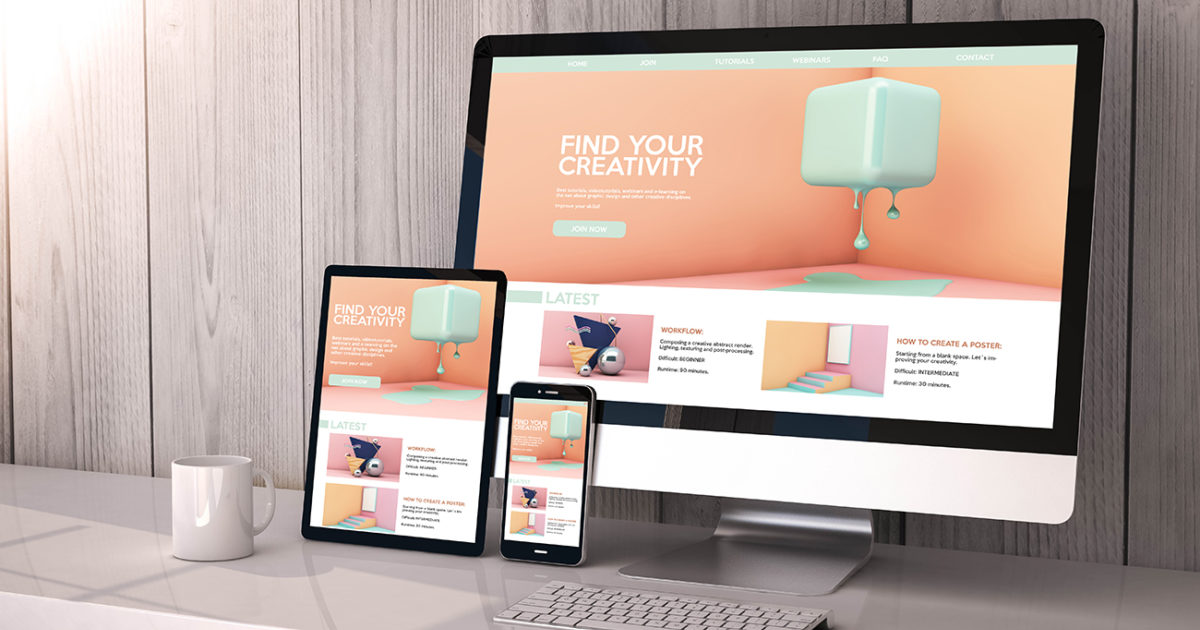
Aside from ensuring seamless navigation, deliver fast loading speeds so they don’t abandon sign-ups halfway due primarily to impatience—a real concern when website sessions record only mere moments before clicking away becomes tempting.
Optimize for SEO
An optimized SEO strategy positions your webinar landing page at vantage points where prospects looking for such content could find it when using search engines like Google. By incorporating relevant keywords subtly into headlines and body copy, bots crawl through better hence improving chances at ranking higher during related searches—and ultimately increasing opportunities at viewer conversion rates.
Furthermore, having meta descriptions succinctly summarizing major benefits serves dual purposes—it not only informs site users about what they stand gleaning but equally gives algorithms context regarding site contents thus even boosting webpage rankings further!
By attracting targeted leads organically through SEO optimizations implemented correctly according to guests’ interests lies greater possibilities in transforming curious visitors into eager participants simply because matching meeting their needs exactly right has occurred!
Enabling the on-demand webinar replay after your webinar is over you can elevate your SEO even further since Google will still crawl your evergreen video content.
Include Social Sharing Buttons
Last but by no means least, comes integrating social sharing buttons onto each event’s specific sign-up portal—thereby magnifying your reach by enabling registrants to share the event with their own network.
Examples of Great Webinar Landing Pages
Surveying the landscape of digital marketing and demand generation, there’s a treasure trove of stellar webinar landing pages spread across diverse industry niches. In peeling back the curtain to uncover what makes these webinar landing pages so effective, I’ll highlight seven examples from celebrated companies and prolific online platforms that excel in crafting enticing experiences for their webinars.
1. Carta
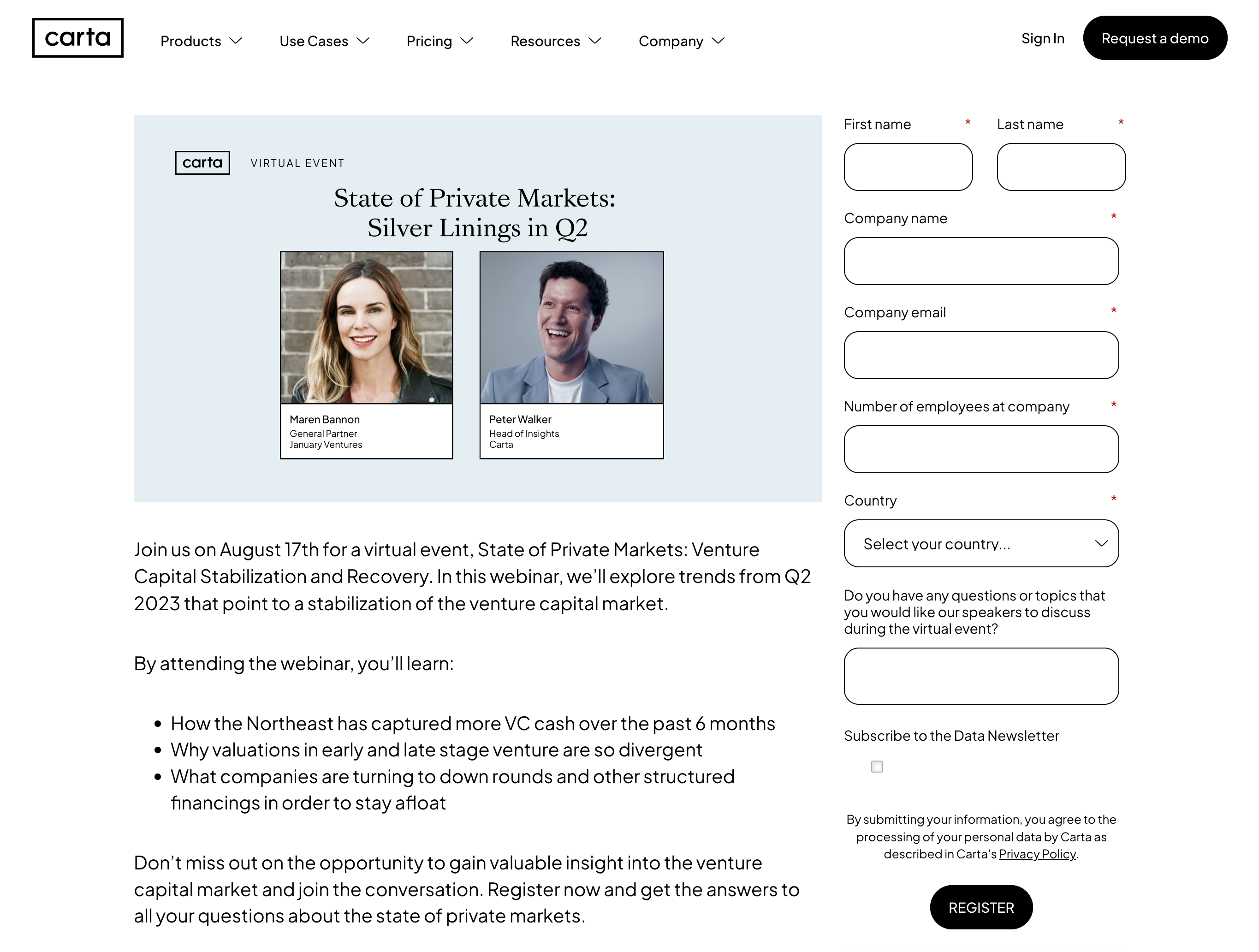
Carta’s webinar landing page stands out as an exemplary embodiment of clarity and brand experience. Promoting a thought provoking webinar on the state of private markets, its headline instantly conveys the pivotal discussion attendees can expect, using jargon appealing to Carta’s capital & equity management audience.
The learning objectives are broken down into digestible bullet points, ensuring easy comprehension. Charismatic headshots of the speakers creates a personal touch while showcasing Carta’s expertise in the field.
2. Userpilot
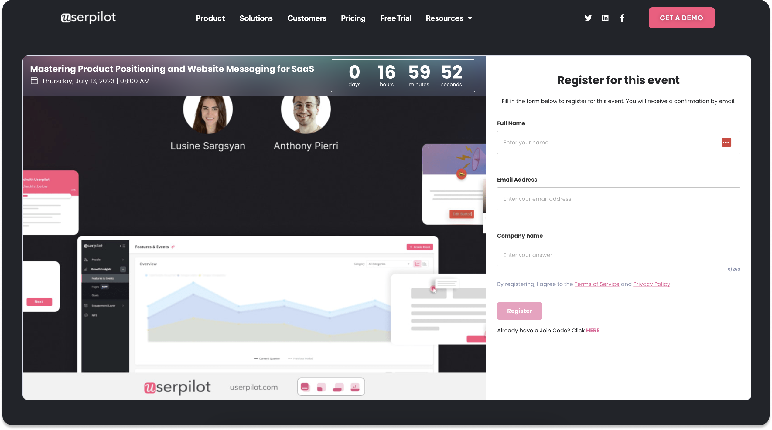
Userpilot’s approach towards their webinar landing page capitalizes on registration simplicity. They only ask their audience for three things: name, email, & company. This removes any extra friction from the sign-up process since there isn’t any extraneous questions asked.
Understated visuals reinforce brand elements which help maintain campaign cohesiveness while making it feel less like a generic landing page and more contextual within the broader Userpilot user experience.
3. Landed
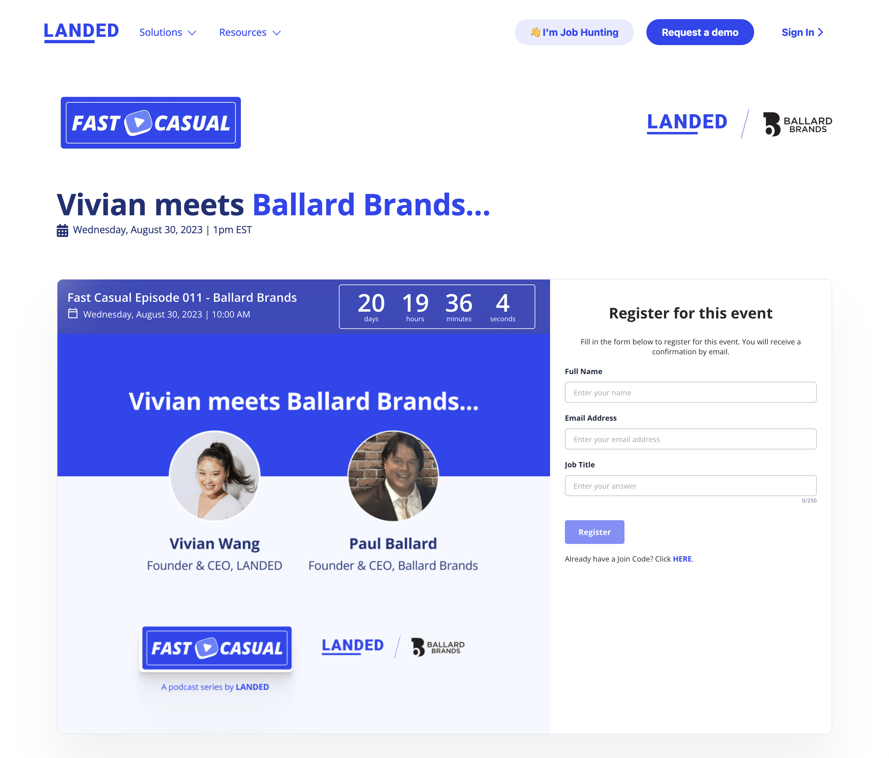
Landed employs an entertaining vibe to their webinar landing pages that aligns with their website brand experience. The use persuasive yet simple copywriting with clear graphics to incite visitors’ curiosity about operations & hiring best practices from business leaders.
They focus on the core value of the session in the description while driving excitement by highlighting notable speaker names and logos.
4. Everflow
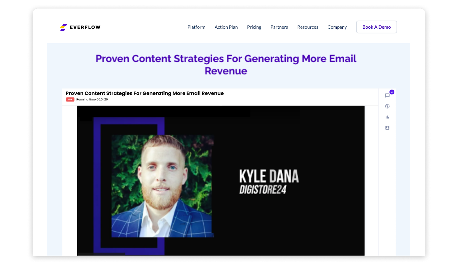
Everflow leverages textbook design principles with a unique take. While they highlight the core discussion points, speaker deatils, and a concise registration form, they also include a blog article at the bottom of the page. This tactic helps them boost their SEO rankings and engage with a larger audience that may want to consume the content in a different format.
Although the blog article is only added to the page after the webinar has ended, the content continues to drive traffic and leads – activating their evergreen content strategy.
5. The Learning Ideas Conference
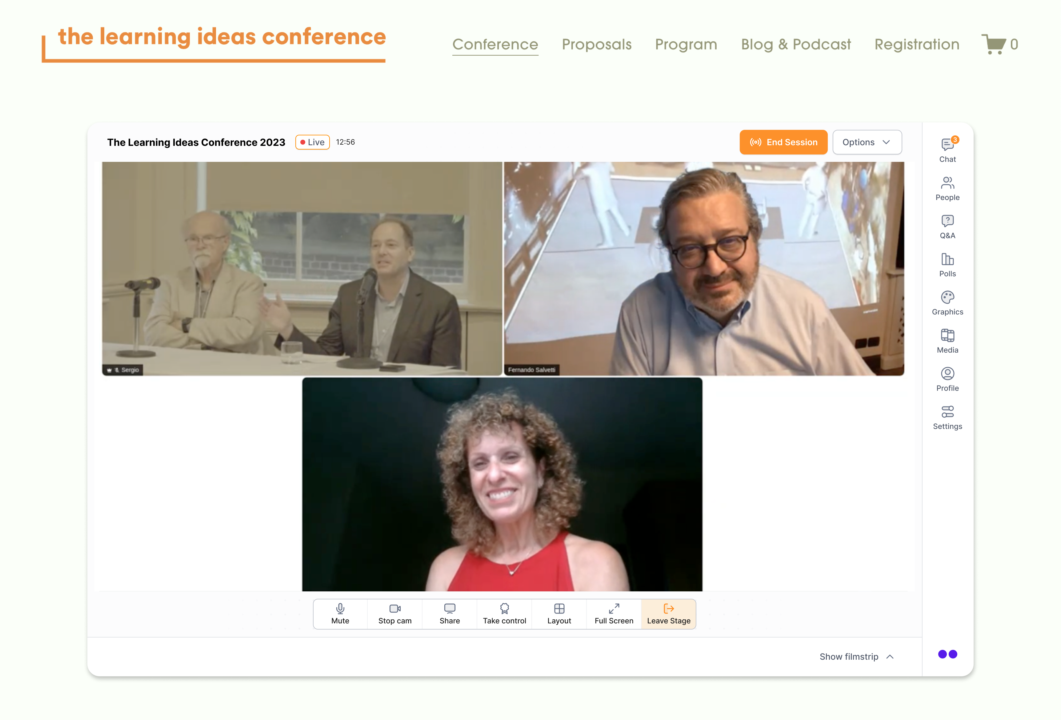
The Learning Ideas Conference is a bit of a different scenario when compared to the other examples. That’s because it’s a hybrid conference rather than just a webinar. However, they have created a similar webinar-like experience for attendees but with exceptional planning to seamlessly navigate people to each session.
Each of their workshops and panel discussions throughout their conference have dedicated landing pages with warm colors infused with personalized snapshots to deliver an inviting atmosphere where participants feel connected before even attending the session.

6. Game Changers
Game Changers is a weekly webinar series that has definitely shown it’s expertise when it comes to hosting webinars on their website. They’ve integrated their core brand experience into their webinar landing pages while also setting the series apart from their product offerings. This tactic allows potential registrants to feel like they are instantly a part of the community without felling like they are being sold to. Even if the high-intent CTAs are still lingering in the navigation bar.
Additionally, key descriptions & speaker highlights connect back to supplementary resources under the webinar embed. Just like in the example with Everflow, Game Changers also repurposes the webinar content into blog articles, supporting their SEO efforts.
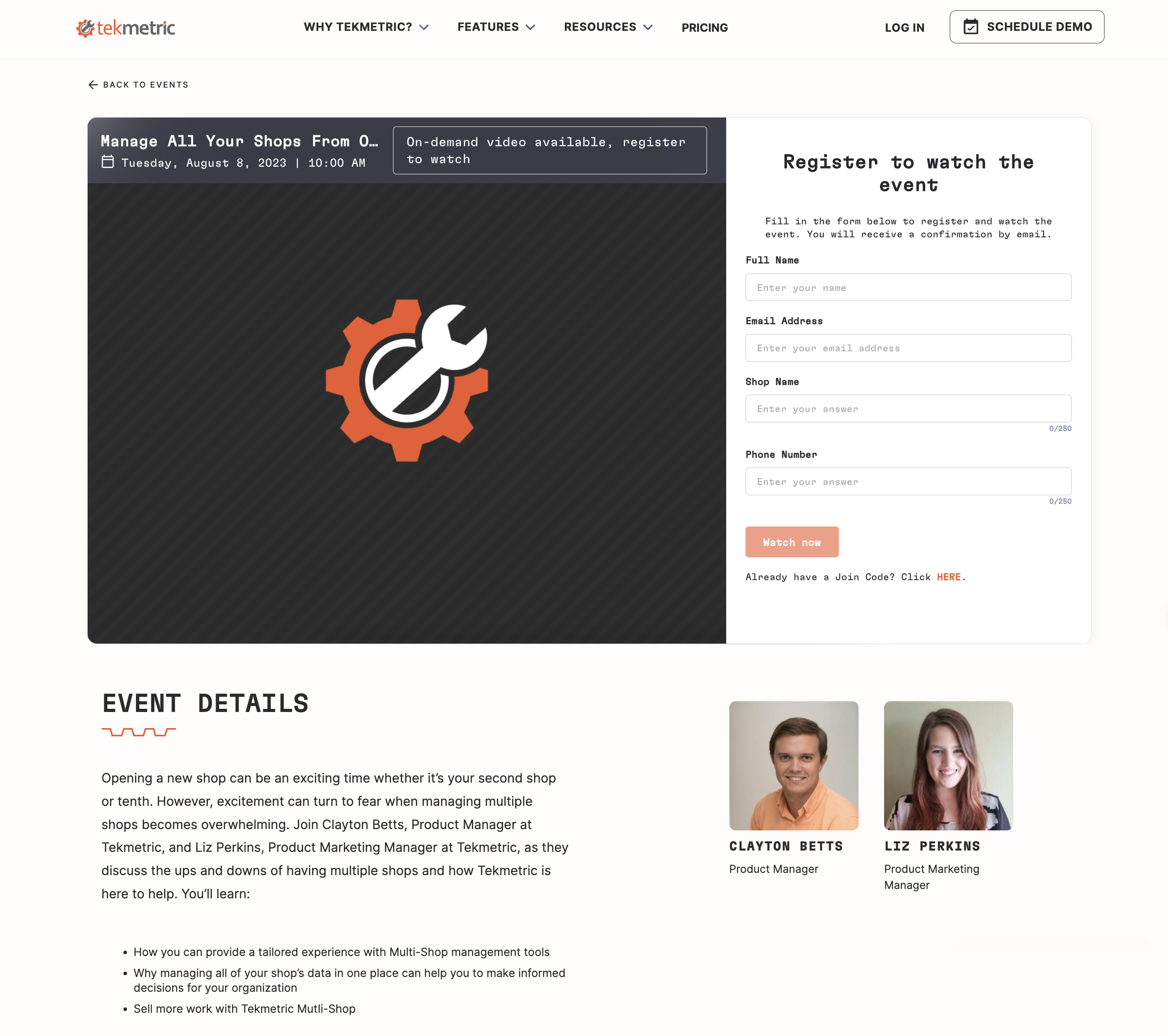
7. Tekmetric
Tekmetric uses striking contrast amid vivid colors with functionality and clarity in mind. When a potential attendee lands on their page, the goal of the webinar is 100% clear. A small yet powerful element they’ve included on their webinar landing pages is the event start time for different regions. It’s easy for people to mix up webinar times when they don’t see different time zones listed. A count down within the webinar experience also helps improve these attendance rates.
Conclusion
Drawing to a close, we’ve plunged deep into the world of webinar landing pages. These platforms are key instruments in locking down your target audience and maximizing turnout for your virtual seminars. The art of designing an efficient webinar landing page lies in striking a perfect balance between eye-catching visuals, punchy headlines, enticing copywriting, and decisive CTAs.
Sprinkling throughout these five essential elements will notch up significantly higher attendee rates. Let’s not forget about making your landing page SEO-optimized, backed by solid reviews and mobile responsiveness. Deploying these tactics will position you at vantage points where potential leads can easily spot and flock toward your webinar sign-up buttons.
The listed recommendations from high-performing companies like Carta to Userpilot serve as spectacular real-life examples of how top-notch webinars can be configured. These webinar landing page examples showcase a variety of effective techniques that can be borrowed or tweaked to fuel your original designs.
Ultimately, worthwhile webinars embedded on engaging landing pages remain a dynamic duo unmatched – one that guarantees thought leadership content for attendees alongside a fruitful lead generation pipeline for hosts like yourself – truly a win-win scenario.